Welcome to Hello-UI Component library

Build Awesome Minimalistic and Beautiful UI using the Hello-UI library. You can design webApps faster by providing a range of reusable components.

Let's get Start...

Installation Hello-UI Component library

Follow eitther of this step to configure and get started with Hello-UI component using in your web dev projects.

Add below code link in your HTML file head tag.

You can add @import and url in you main css file.

Avatar

Here we created custome classes for different sizes of Avatar.

Different sizes: Small:avatar-sm, medium: avatar-md, large: avatar-l, Extra large: avatar-xl. In img tag src attribute contain image path.

avatar-small
avatar-medium
avatar-large
avatar-extraLarge

Alert

Here we created custome classes for different types of Alerts.

Different types of alert we have.

  1. Alert for Informative message uses class : alert alert-info
  2. Alert for Warning message uses class : alert alert-warn
  3. Alert for Error message uses class : alert alert-error
  4. Alert for Success message uses class : alert alert-success
This alert box indicates informative changes ×
This alert box indicates warning changes ×
This alert box indicates error changes ×
This alert box indicates success changes ×

Badges

Here we created custome classes for different types of Badges.

Different types of badge for Icon, Avatars, on Button we have classes.

  1. Badge on icon uses class : badge badge-icon-val
  2. Badge on button uses class : badge badge-icon-val
  3. Badge on avatar with value uses class : badge badge-img
  4. Badge for showing availability uses class : badge badge-stat
3
3
avatar 3
avatar-status

Button

Here we created custome classes for different types of Button.

Different types of buttons classes we have.

Solid buttons

  1. For success :btn btn-success
  2. For error :btn btn-error
  3. For warning :btn btn-warning
  4. For call to action :btn btn-cta
  5. For info :btn btn-info

With Outline buttons

  1. For success :btn btn-success-outline
  2. For error :btn btn-error-outline
  3. For warning :btn btn-warning-outline
  4. For call to action :btn btn-cta-outline
  5. For info :btn btn-info-outline

Button with icon in it

  1. Outline button with Icon :btn btn-cta-outline-icon
  2. Solid button with Icon :btn btn-cta-icon

Link button

  1. Button link :btn btn-link

Float button

  1. Foat link :btn btn-float

Cards

Here we created custome classes for different types of Cards.
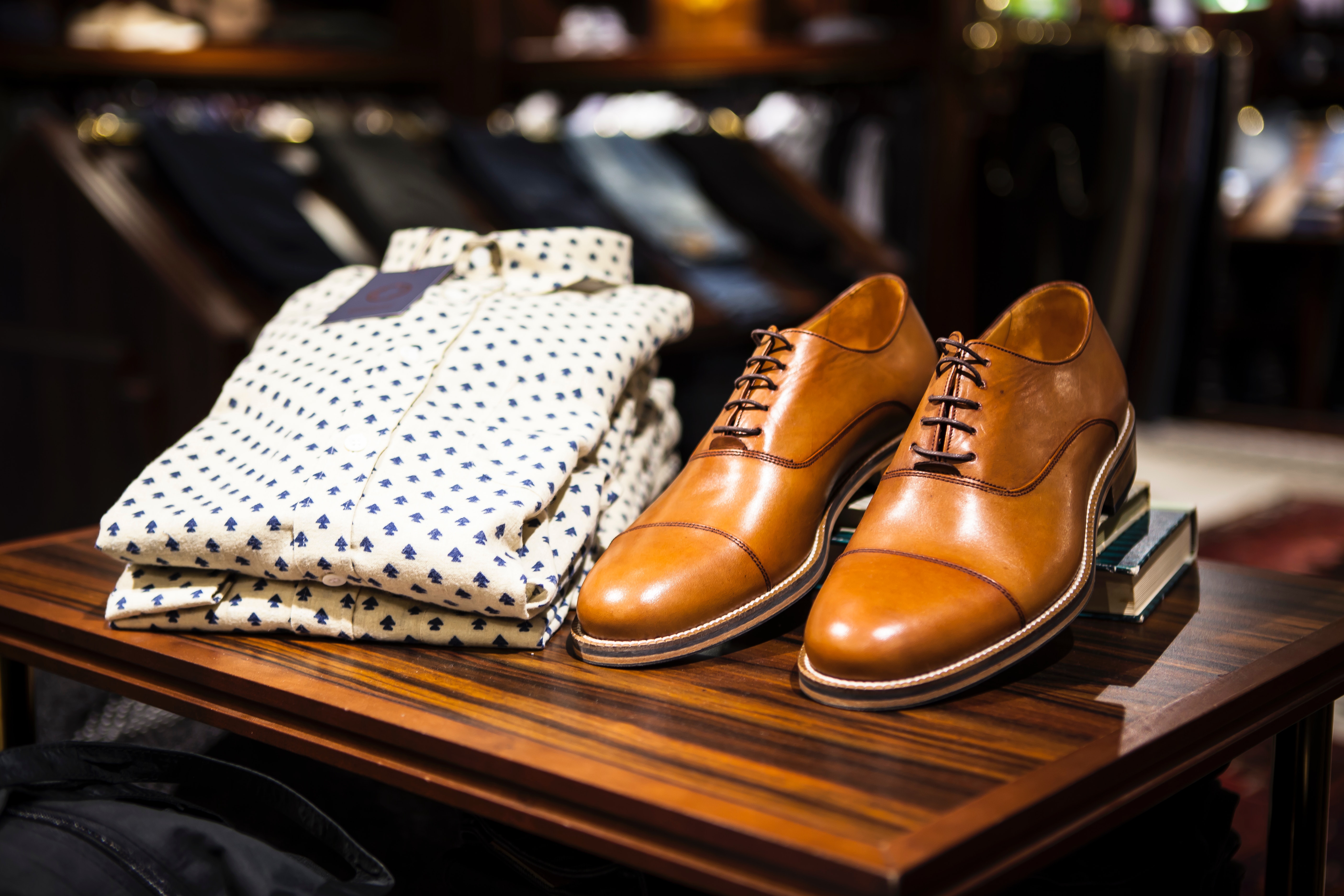
1. Horizontal card with shadow

Shirt
New Arrival
Men Premier Shirt
lorem Lorem ipsum dolor sit amet consectetur adipisicing elit.

2. Horizontal card with dismiss

Shirt
New Arrival
Men Premier Shirt
lorem Lorem ipsum dolor sit amet consectetur adipisicing elit.

3. Vertical card

Shirt
Men Premier Shirt
₹ 2000

4. Vertical card with badge

Shirt
Men Premier Shirt
₹ 2000

5. Vertical card Text with overlay

Shirt
Men Premier Shirt
lorem Lorem ipsum dolor sit amet consectetur adipisicing elit.

6. Card Text only

Men Premier Shirt
lorem epsum
lorem Lorem ipsum dolor sit amet Lorem ipsum dolor sit ametconsectetur adipisicing elit.

Images

Here we created custome classes for different types sizes of image.

1. Thumbnail images

  1. For thumbnail image use class img-thubnail
Thumbnail

2. Circular/Round images

  1. For round/circular image use class img-round
Round

3. Responsive images

  1. For responsive image use class img-fluid
Responsive

4. Align images

  1. For align image container space between use class d-flex space-between
  2. For individual image use class img-thumbnail

Input

Here we created custome classes for Input.

1. Input text box

Without validation for input use class

  1. Group input :input-group
    1. for label :label
    2. for input in this group :form-control

2. Form with validation

With validation for input use class

  1. Group input :input-group
    1. for label :label
    2. for input in this group :form-control validation
Please enter correct UserId
Please enter correct Password

Text Utilities

Here we created custome classes for text utilities.

1. Headings

  1. for Heading 1 class : h1
  2. for Heading 2 class : h2
  3. for Heading 3 class : h3
  4. for Heading 4 class : h4
  5. for Heading 5 class : h5
  6. for Heading 6 class : h6

Heading 1

Heading 2

Heading 3

Heading 4

Heading 5

Heading 6

2. Paragraphs

  1. for small text use class : text-sm
  2. for medium text use class : text-md
  3. for large text use class : text-l
  4. for extra large text use class : text-xl

Small Text

Medium Text

Large Text

Extra Large Text

3. Text Decoration

  1. For text mark : text-mark
  2. For text gray : text-gray
  3. For text line through : line-through
  4. For text center : text-center

This is a Mark Text Example

Grey Text

This is a line-through Text Example

Text at center of the container

Grids

Here we created custome classes for Different types of Grids.

1. Grid-2: two items in a grid row

One
Two

2. Grid-2: two items in a grid column

One
Two

3. Grid-3: Three items in a grid row

One
Two
Three

4. Grid-3: Three items in a grid column

One
Two
Three